Overview
General Info
Type: Abugida / Alphasyllabary / Akshara script
Languages: Hindi, Marathi, Nepali, Sanskrit, Awadhi, Bhili, Bhojpuri, Garhwali, Gujari, Konkani, Kumaoni, Magahi, Maithili, Marwari, Newari, Sindhi and many others.
Actively used by: over 500 million
Time period: ~700 CE–present
Direction: Left-to-right
Devanagari Character Notes
ScriptSource
Introduction
Devanagari is one of the most widely used writing systems in the Indian subcontinent, it is used for the representation of well over a hundred languages including Hindi, Marathi, Nepali, and Sanskrit. Within the broad geographical division of the region, Devanagari is designated as a north Indian script, and is grouped with others like Gujarati, Gurmukhi and Bengali, which bear a close structural as well as graphic resemblance to it.
Devanagari combines features of purely syllabic writing systems with alphabetic principles in a hybrid system that is characteristic of most Indian scripts. For this system, there is no standard term on which consensus has been formed, it is variously referred to as ‘alphasyllabic’, ‘abugida’, or ‘akshara script’. The characters in this system are divided into vowels and consonants and their arrangement follows a logical order based on what was originally the highly developed and precise Sanskrit phonological system. This arrangement places the consonants in groups according to the position of the articulated sounds, from the base of the tongue to the front of the mouth. Devanagari is thus a phonetic script where specific symbols correspond to specific sounds, the written word closely approximating the spoken word.
Functionality
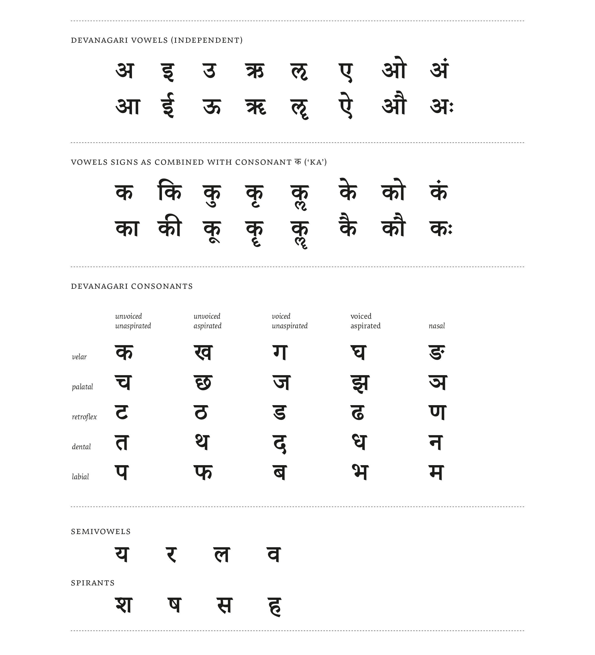
The Devanagari syllabary arranged on the basis of the Sanskrit phonological system is called varnamala (which literally translates to ‘garland of letters’) and is divided into 14 vowel characters (svara), 33 consonant characters (vyanjana), and two modifiers (anusvara and visarga) that are placed at the end with the vowels in the syllabary. In modern usage, however, and depending on the language the script is used for, the number of vowels varies and is usually limited to ten or twelve. Each unit of graphemic symbols in the syllabary is called ‘akshara’ which represent syllables: all consonants have an ‘inherent vowel’ ‘a’. The virama sign is used in order to indicate the removal of this inherent vowel. Devanagari is written from left to right, top to bottom.
Devanagari Vowels (independent)
| A/Aa | I/Ii | U/Uu | Ri/Rii | Lri/Lrii | E/Ai | O/Au | Modifiers |
|---|---|---|---|---|---|---|---|
| अ | इ | उ | ऋ | ऌ | ए | ओ | अं |
| आ | ई | ऊ | ॠ | ॡ | ऐ | औ | अः |
Devanagari Consonants
| unvoiced unaspirated | unvoiced aspirated | voiced unaspirated | voiced aspirated | nasal | |
|---|---|---|---|---|---|
| velar | क | ख | ग | घ | ङ |
| palatal | च | छ | ज | झ | ञ |
| retroflex | ट | ठ | ड | ढ | ण |
| dental | त | थ | द | ध | न |
| labial | प | फ | ब | भ | म |
| semivowels | य | र | ल | व | |
| spirants | श | ष | स | ह |
Although the basic set of characters in the Devanagari syllabary is fairly small, the combination of vowels with consonants, and of consonants with other consonants is a basic feature of the script and this leads to a large character set. Vowels can be represented independently as shown in the syllabary, but when vowels combine with consonants they take the form of vowel signs or matras, forming what can be called syllabic ligatures.
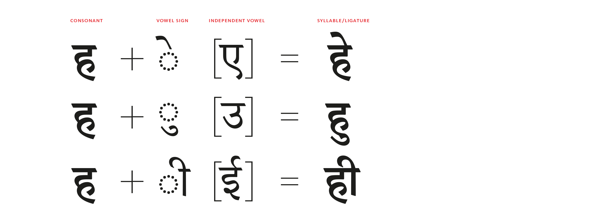
These vowel signs are placed above, below, or on either side of the base consonant – the position of each vowel sign is predefined with few exceptions, i.e. the sign for the vowel short-U always joins under the base character, except when the base character happens to be the Devanagari letter ‘Ra’. These combinations can have a fair amount of variation based on the height at which the vowel sign attaches to the the base character, or the width of base character to be covered by the vowel sign, or the termination at which the vowel sign joins etc.
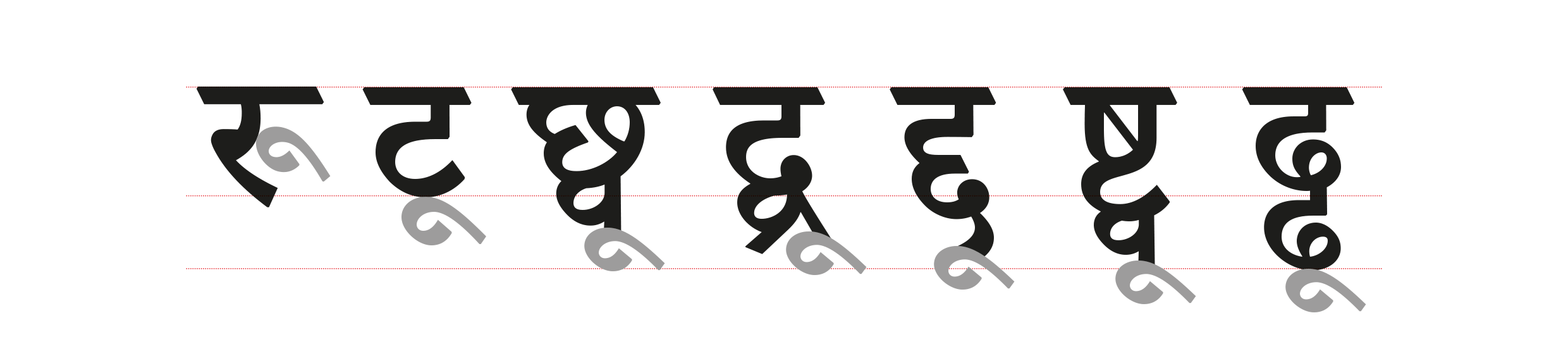
The larger variation derives from the fact that consonants also combine with other consonants, by the removal of the intervening inherent vowel, and result in what is known as sanyuktakshar or ‘conjunct’ characters. These combinations can be represented in various ways, horizontally as well as vertically. In some instances the resulting conjunct character retains some resemblance to the constituent combining characters, while in others there is a complete transformation into an altogether different symbol.
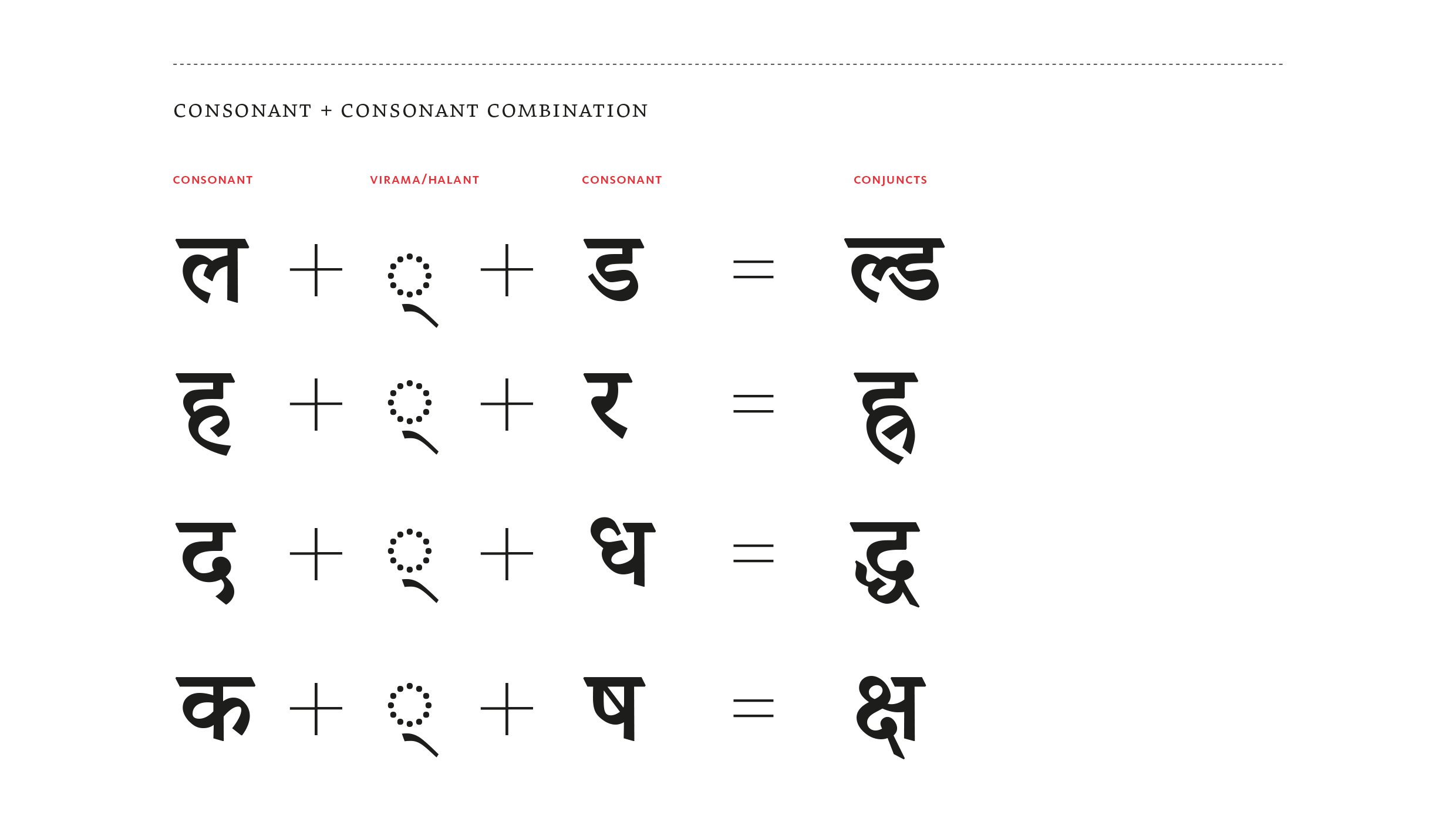
Depending on the sounds to be represented, these combinations can occur between two, three, or more consonants, which in turn may be combined with a vowel. There are also multiple ways of representing the same combinations using a variant form. Modern usage increasingly tends towards a preference for horizontal combinations, while classical text and Devanagari used for Sanskrit generally employs vertical formations of the same conjuncts. However, there is no set standard and usage is often defined by regional preferences, common practise and influence, or simply by individual taste.
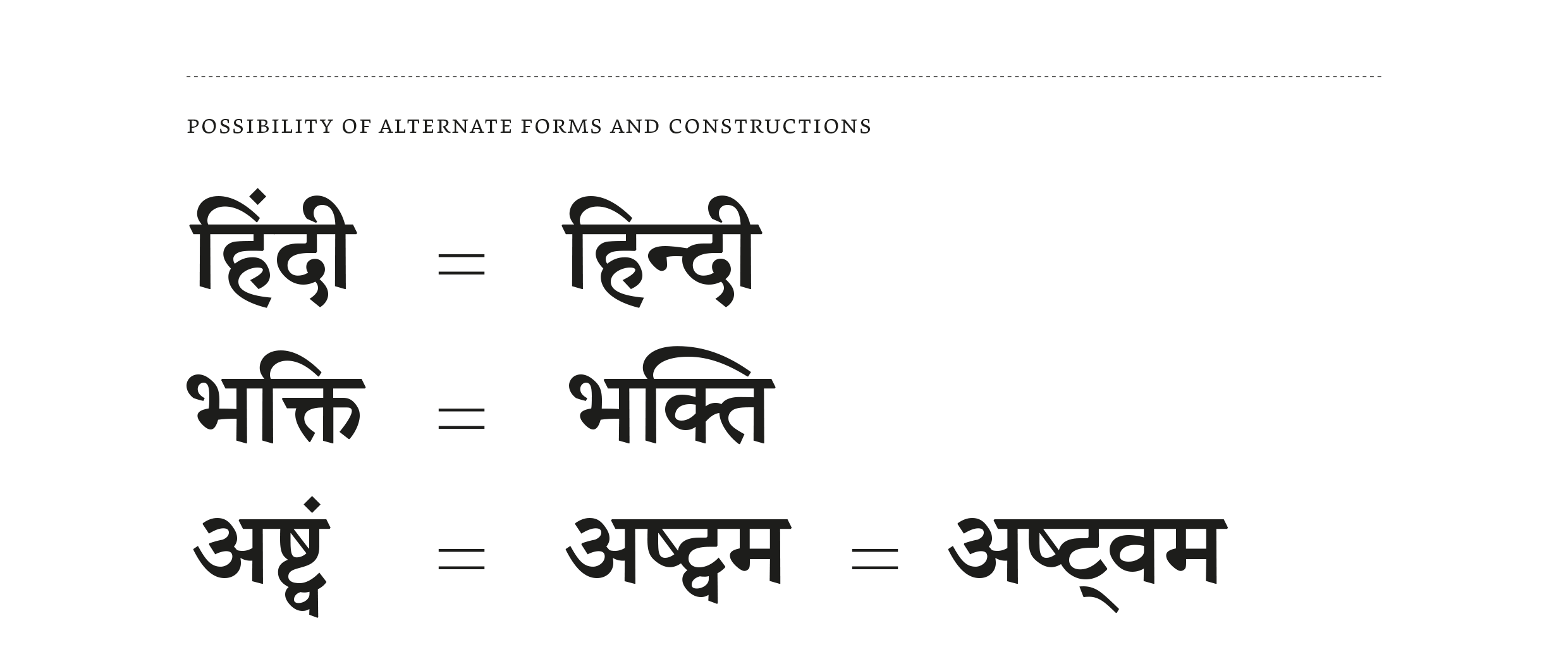
The character set in a Devanagari typeface is thus a somewhat indeterminate issue. The number of conjuncts (i.e. consonant combinations) included in the character sets of different typefaces depends largely on the design, the frequency of the occurrence of the conjuncts, and the language coverage aimed for. Regional preferences for particular characters also means that alternate forms are required for specific characters and their combinations. The glyph count in fonts can vary from 400 to 1000 depending on these factors, and not all forms of a particular combination may always be available in a given typeface.
Glyph Requirements for Each Language
In order to define the required characters & glyphs to render each of the documented languages, we have taken the minimal Hindi character set as the base. Any additional glyphs for other languages are noted when necessary.
| Language | Glyphs |
|---|---|
| Hindi | अ आ इ ई उ ऊ ऋ ऍ ऎ ए ऐ ऑ ऒ ओ औ ◌ा ि ◌ी ◌ु ◌ू ◌ृ ॄ ◌ॅ ◌े ◌ै ◌ॊ ◌ो ◌ौ ◌ं ◌ः |
| क ख ग घ ङ च छ ज झ ञ ट ठ ड ढ ण त थ द ध न प फ ब भ म य र ल व श ष स ह | |
| क्◌ ख्◌ ग्◌ घ्◌ च्◌ ज्◌ झ्◌ ञ्◌ ण्◌ त्◌ थ्◌ ध्◌ न्◌ प्◌ फ्◌ ब्◌ भ्◌ म्◌ य्◌ र्◌ ल्◌ व्◌ श्◌ ष्◌ स्◌ ह्◌ | |
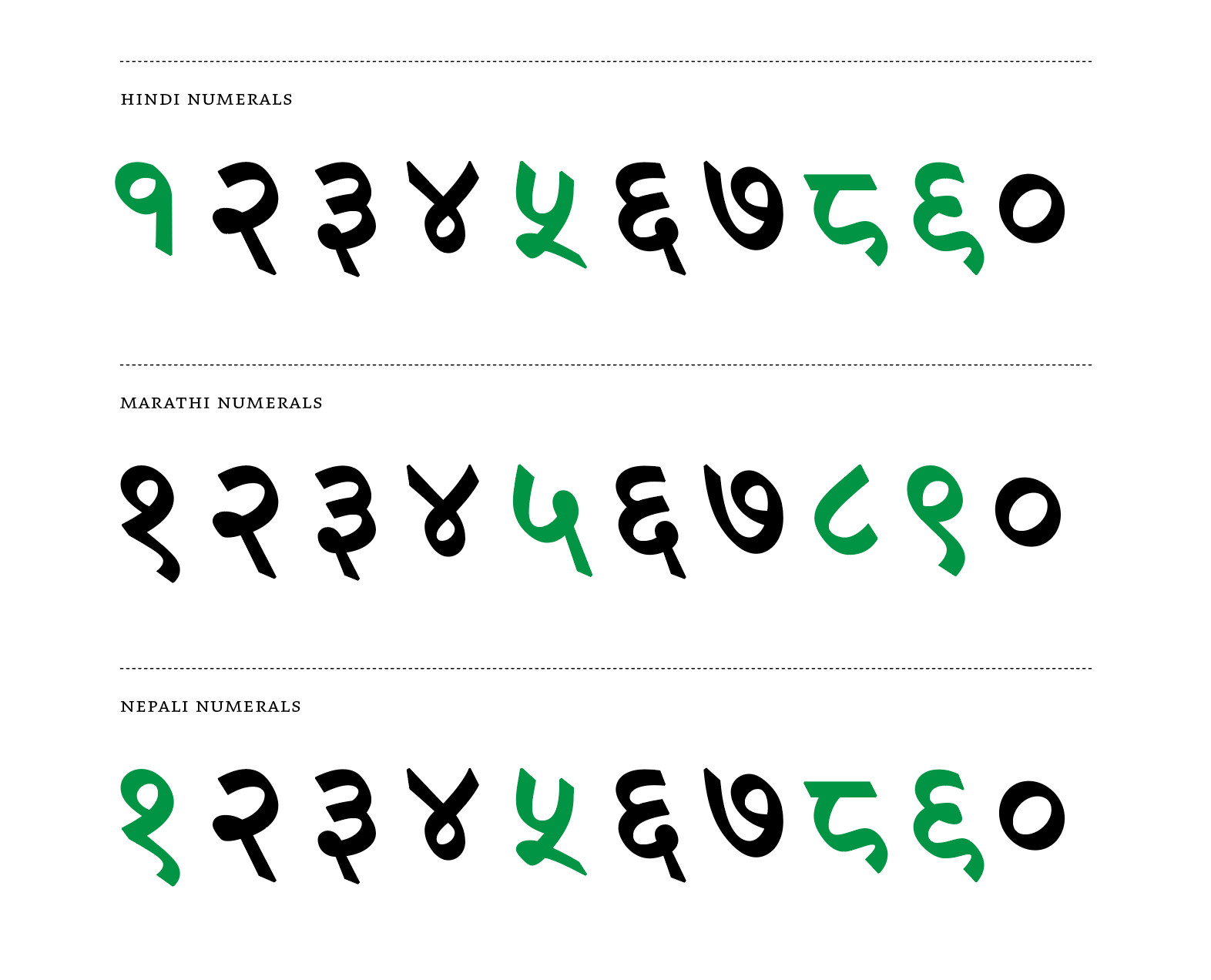
| ० १ २ ३ ४ ५ ६ ७ ८ ९ | |
| ़ ऽ ् । ॥ ॰ ॽ ࿕ ॐ ृ | |
| Bodo | ’ |
| Kashmiri | ॳ ॴ ॶ ॷ ऎ ऒ ॵ च़ छ़ ॖ ॗ ॆ ऺ ऻ ॊ ॏ |
| Konkani | ळ ळ्◌ ऱ्ह |
| Marathi | ॲ ळ ळ्◌ ऱ्ह ल(alt) ल्◌(alt) श(alt) श◌(alt) १(alt) ५(alt) ८(alt) ९(alt) |
| Nepali | झ(alt) झ्◌(alt) १(alt) ५(alt) ८(alt) ९(alt) |
| Rajasthani | ॸ ळ ळ्◌ |
| Sindhi | ॻ ॼ ॾ ॿ |
| Sanskrit | ॠ ऌ ॡ ॢ ॣ ऀ ॕ ॑ ◌॒ |
This list is also available as a .CSV file which also includes relevant Unicodes.
Comparison with Latin
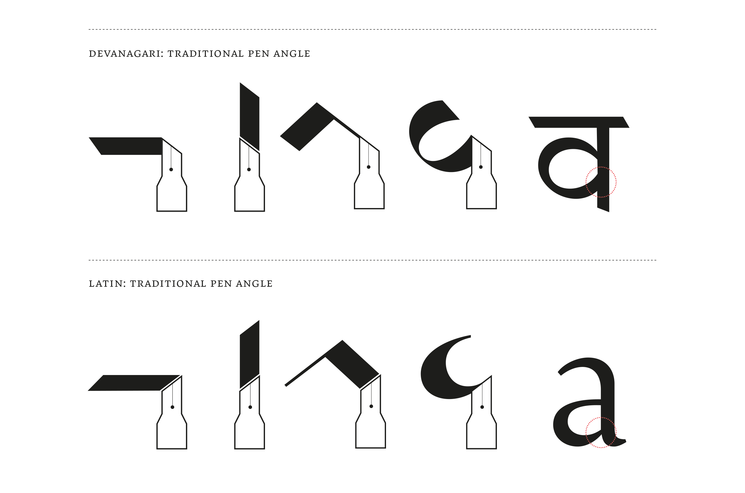
The traditional stress in Devanagari writing derives from the reed or bamboo pen, which is cut at an angle opposite to that of the Latin broad-nib pen. This is a critical difference as it means that at the junction where a rounded stroke meets the vertical, the joint thickens instead of thinning. This thick joining is a characteristic feature of the texture of high contrast Devanagari, and in a conventional setting it is crucial for its legibility. Thinning the joints in imitation of Latin stress results in a ‘reversed contrast’ style that makes for odd effects in text. Like any design feature, though, reversed contrast can be intentionally and purposefully utilised in display settings.
Another characteristic feature of Devanagari is the horizontal ‘headline’ or shirorekha which is drawn over the width of each letter, when the letter appears independently, and over the width of words in a sentence demarcating or tying together each word. The headline is the basic organizing principle in Devanagari as opposed to the baseline, and letters ‘hang’ from this headline extending downward. Some vowel marks and modifier signs are placed above the headline, so it acts as a central aligning element.
Besides broad categories such as text, decorative, and display types, the division of ‘styles’ in Devanagari is based primarily on stroke contrast, with high contrast typefaces serving as complements to Latin serif typefaces while low contrast fonts pair with Latin sans serif typefaces. Secondary styles of Devanagari typefaces are sometimes used to complement Latin italics, but more often than not these are oblique versions of the upright. Heavier weights are frequently used not only for titles and emphasis, but also for differentiation and articulation within text setting scenarios that involve more complexity, like bibliographies or dictionaries. Unlike Latin, Devanagari is a unicase script: there are no capitals or small-caps and the typographic variants are often limited to changes in weight, angle of slant, or the use of different typefaces and colour.
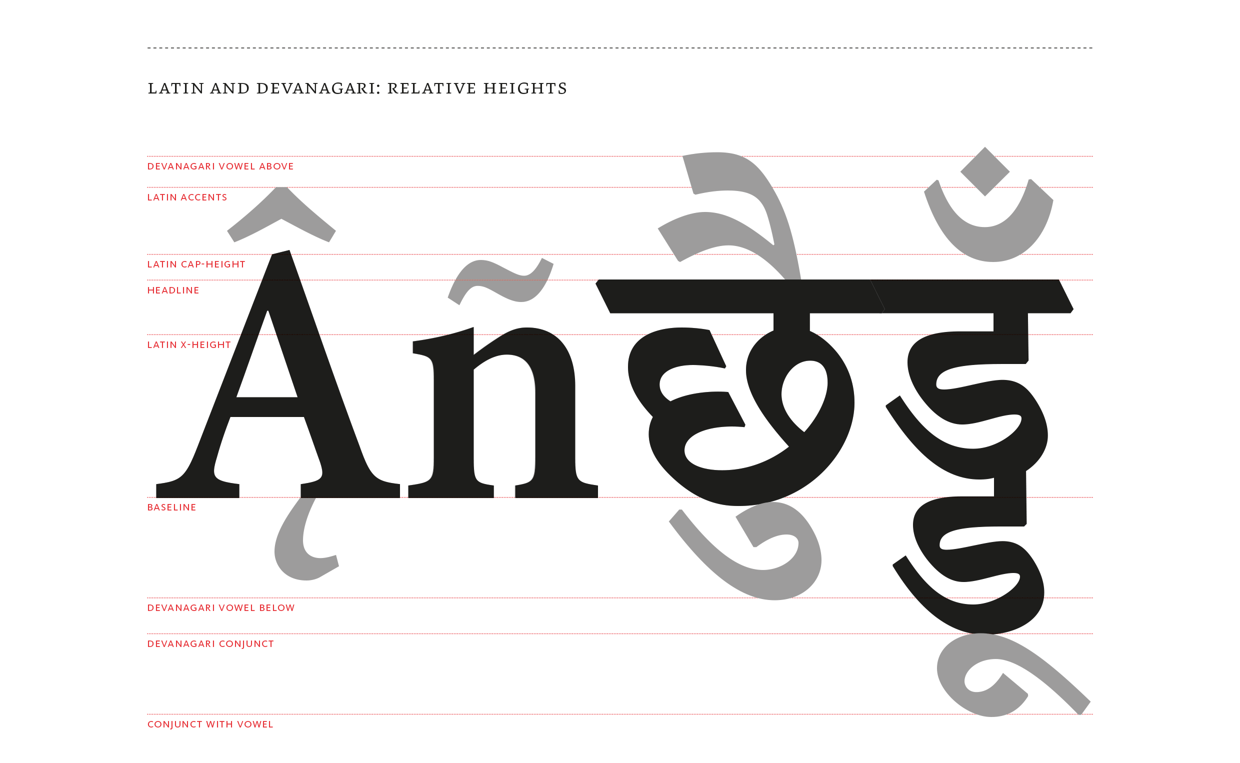
The sizing of Devanagari characters in comparison with the Latin is defined by the relation between the body size of Devanagari base characters and Latin vertical proportions. As a rule of thumb, the headline in Devanagari usually sits somewhere between the Latin small-cap height and the cap-height, depending on the relative sizes of the counters, while a notional baseline is shared between representative Latin and Devanagari characters. Depending on the language to be typeset, the baseline serves only as a rough guide and alignment zone as much activity in Devanagari takes place below it and multiple tiers of conjuncts and vowel signs make the lower part more deep and important for legibility compared to Latin. The necessity of multiple levels in Devanagari composition is one reason why making the body height of base characters indiscriminately large does not work well in balancing Devanagari counter sizes with Latin. Sufficient allowance is required both above and below the base characters for vowel signs and conjuncts, so the relative sizing of Latin and Devanagari must take into account at least a three-tier division of space, with obvious implications for line-spacing.
Devanagari has its own set of numerals and a limited set of punctuation marks: such as to indicate the end of sentences (danda or virama), an abbreviation sign etc. Latin punctuation marks like the comma, quotations, exclamation, question mark etc are also used to serve their expected function in Devanagari text.
Bilingual Approach / Type Design
As a general approach in combinations of Latin and Devanagari, serif typefaces are usually paired with modulated, higher-contrast Devanagari and sans serifs with low contrast Devanagari. In combining typefaces for both scripts with traditional stroke modulation, the most immediate observable difference is the angle of stress. The Latin and Devanagari angles are opposite to each other and this can seem like an insurmountable problem at first glance. However, it is useful to keep in mind that in any well-executed typeface and in any respectful combination, each script should hold its own integrity and fulfil its functional expectations first, before any notions of ‘harmonisation’ or ‘matching’ can be entertained meaningfully.
A similar principle applies to questions of layout and spacing. In combining scripts at the level of parallel settings, it may be more reasonable to retain and utilize the best options for layout and space considerations for each of the two scripts independently, instead of forcing a common solution that may not help either. In mixed-setting, where the scripts are combined at the level of paragraphs or lines, the problems become more complex and it is generally useful to keep in mind that Devanagari text will, in most cases, require more generous line-spacing compared to Latin, due to the necessary vowel signs above and below the base characters.
Characteristics like the opposite angles of stress and features such as absence of serifs etc are not anomalies or incongruities in combining Latin and Devanagari typefaces, the appropriate shaping applies to each script within any reasonable combination. These and other differences may be less obvious in low contrast typefaces, though the same principles apply in more subtle ways. Directly transferring the Latin stress to Devanagari, whether in high contrast or low contrast typefaces, often only hinders readability by removing the emphasis from areas where the emphasis is expected – i.e. where the thicks and thins in strokes usually go at the level of individual letters and the coherence of the pattern they create together at the level of overall texture. The choice of typeface in this scenario makes a great deal of difference and it is an easy mistake to indiscriminately transpose typographic practices and expectations from one script to another. The interaction and intermixing of scripts can and should be an occasion for new ideas and new design solutions – the flow of ideas, however, cannot be unidirectional, influencing or prioritising one script at the expense of another. The results of transposing typographic ideas across scripts are always more interesting, and more successful, when novelty in design is informed by historical awareness and a grounded understanding of textual practices.
Short notes on typographic design
-
Open loops in handwritten Devanagari letters often become closed ‘knots’ in type, especially in typefaces meant to be used at text sizes. These knots are an intrinsic part of some Devanagari characters – not troublesome ‘dark spots’ in the texture but essential elements for clarity and proper distinction between letters.
-
Vertical alignments in Devanagari are not based on notions of baseline and x-height. The head-line (shirorekha) from where letters ‘hang’ is a characteristic feature and the basic organising element. The depth of characters and conjuncts varies, based on their shape and the relationship between their counters.
-
Vowel signs in Devanagari extend above and below the base characters, besides also flanking them on either side. These vowels are not discretionary in the text but essential for it to make sense. Interpreting them as ‘marks’ does not mean a licence to skimp on size, they deserve generous and distinctive proportions for themselves in relation to the design of the consonants.
-
Due to the extension of vowel signs above and below base characters, as well as vertical conjunct forms, Devanagari text requires more generous line-spacing in relation to Latin in order to accommodate this additional depth. Line-spacing is defined considering the frequency of deep vertical conjuncts, which depends on the language being typeset: in modern Hindi and Marathi texts, the frequency of vertical conjuncts is lower compared to Sanskrit.
-
In trying to balance Latin and Devanagari grey values, for comparable colour on the page, it is useful to keep in mind that at first glance the Devanagari texture almost always appears more busy due to multiple tiers and smaller counter spaces. The comparison should not be made between the counters of Devanagari letters and large open characters in Latin, like lowercase ‘bdpqo’ or capitals, but with characters like lowercase a, e, g and s, that have multiple levels and more comparable defining characteristics in their counters.
-
There are regional preferences and language-specific variations for certain Devanagari characters (e.g. झ, ल, श) and numerals (१, ५, ८, ९) that need to be noted for relevant contexts of use.